Podcasting
·
Oct 15, 2026
Episode Artwork That Still Looks Great on a Tiny Phone Screen
Arif Gursel
Founder

Our example creator, Tasha, has a problem she did not expect. Her first three episodes are edited, the audio sounds warm and clear, and her show notes from last week are tight and useful. But when she uploads a test episode to her hosting dashboard and previews it on her phone, the cover art she made in twenty minutes on a Sunday night looks like a gray smudge. The title is unreadable. The cartoon atom she loved disappears entirely.
If you have been following this series, you know Tasha as our illustrative creator: a middle school science teacher in Rainier Valley building a podcast for parents of curious kids, where each episode answers one real question a kid asked. She has done the hard work of planning, recording and editing. Now she is learning a lesson every podcaster learns eventually: people decide whether to press play based on a tiny square or rectangle, often in less than a second. Your artwork is the front door to everything you have built.
In this part, you will learn how show cover art differs from episode artwork and video thumbnails, the current specs for the major platforms, the design principles that make art readable at tiny sizes, and how The Union's sets, production team and creative community can help you produce artwork that looks as good as your show sounds.
Know the three kinds of podcast artwork
Beginners often think of "the cover" as one image. In practice, most shows need three related pieces of art, and each one has a different job.
Show cover art
This is the square image that represents your entire podcast in Apple Podcasts, Spotify and other apps. It rarely changes. Its job is recognition: someone scrolling a category list should be able to tell what kind of show it is and remember it next time.
Episode artwork
Many hosting platforms let you attach a unique square image to each episode, and some listening apps display it on the episode page or in the player. Support varies by app and changes over time, so treat episode art as a bonus layer. Its job is to signal "this episode is about this specific thing."
Video thumbnails
If you publish your episodes as video on YouTube or as video podcasts on Spotify, you need a widescreen thumbnail (16:9). This is where the click battle is fiercest. Thumbnails compete against every other video in someone's feed, so they lean on faces, emotion and very short text.
Tasha decides to build all three. Her show cover will carry the brand. Each episode gets a square card featuring the kid's question. And because she is also filming her episodes, each video gets a thumbnail built around her face reacting to the question.
Current specs for the major platforms
Specs are boring until a platform rejects your upload. Here are the numbers that matter as of this writing. Platforms do update their requirements, so check each one's help center before a big launch.
Apple Podcasts show artwork: square, minimum 1400 x 1400 pixels, maximum 3000 x 3000 pixels, JPEG or PNG, RGB color space, 72 dpi. Apple recommends designing at 3000 x 3000.
Spotify show artwork: square. Spotify's minimum is lower than Apple's, but if you design at 3000 x 3000 you will satisfy both, and your hosting platform will usually distribute that single file everywhere.
Episode artwork: use the same square specs as your show cover. A 3000 x 3000 master keeps things simple.
YouTube thumbnails: 1280 x 720 pixels (16:9), minimum width 640 pixels, in JPG, PNG or GIF. YouTube has long listed a 2MB file limit, though limits have shifted over time, so check the current guidance. You need a verified account to upload custom thumbnails.
Social promotion: square (1080 x 1080) still works on most feeds, portrait 4:5 (1080 x 1350) takes up more screen space on Instagram, and vertical 9:16 (1080 x 1920) is standard for Reels, Shorts and TikTok. Instagram has also been shifting toward taller grid previews, so test how your posts crop.
Two more rules from Apple that catch people: your art cannot use Apple's logos or imply endorsement, and it should not include explicit imagery or copyrighted material you do not have rights to. Spotify and YouTube have similar content policies. The safest path is original photos, licensed fonts and graphics you made or properly licensed.
Design for the size people actually see
You design at 3000 pixels, but listeners see your cover at roughly the size of a fingernail in search results and category lists. That is the size you must design for. Everything else follows from this one fact.
Principles that hold up at thumbnail size
One focal point. A face, a bold object or a single graphic shape. Tasha's original cover had an atom, a beaker, a lightbulb and a question mark. At phone size it was noise.
Few words, big letters. Your show name, and possibly a short descriptor. Skip host names and taglines unless they are part of the brand. If your title is long, set the key word large and the rest smaller.
High contrast. Light text on a dark background or the reverse. Mid-tone text on a mid-tone background vanishes. Squint at your design: if the title disappears, the contrast is too low.
Two or three colors. A tight palette reads as intentional and makes your show recognizable across episodes.
Thick, simple fonts. Thin scripts and delicate serifs break apart when shrunk. Choose a heavy sans serif or a chunky display font, and make sure your license covers commercial use.
Respect the edges. Keep important elements away from the outer margins, since some apps round corners or overlay play buttons.
Thumbnail specifics for video
YouTube thumbnails follow the same principles with a few additions. Faces with clear emotion tend to draw the eye. Text should be three to five words, and it should add to the title rather than repeat it. Keep the bottom right corner clear, since YouTube places the video length there. And make sure the thumbnail honestly reflects the episode: misleading thumbnails might win a click, but viewers leave fast, and that hurts how platforms recommend your work.
YouTube has also been rolling out a "Test and Compare" feature in YouTube Studio that lets you upload multiple thumbnails for one video and see which performs best. Availability has expanded over time, so check whether your channel has it. It is a great way to learn what your audience responds to instead of guessing.
How Tasha rebuilt her show cover
Tasha started over with a simple brief she wrote in ten minutes: "Parents of curious kids. Warm, smart, a little playful. Should feel like science class with your favorite teacher." That brief became her filter for every decision.
She sketched three directions on paper first. One was purely typographic, one used an illustrated kid looking up at a giant question mark, and one used a photo of Tasha herself mid-laugh. She shrunk each sketch on her phone screen and showed them to five parents at her school's pickup line. The photo direction won easily. Parents said it felt like a real person they could trust with their kid's questions.
That raised a new challenge: she needed a strong photo. A selfie in her classroom would not cut it. Lighting was uneven, the background was cluttered with posters, and her phone camera struggled with the fluorescent lights.
Shooting cover photos on a real set
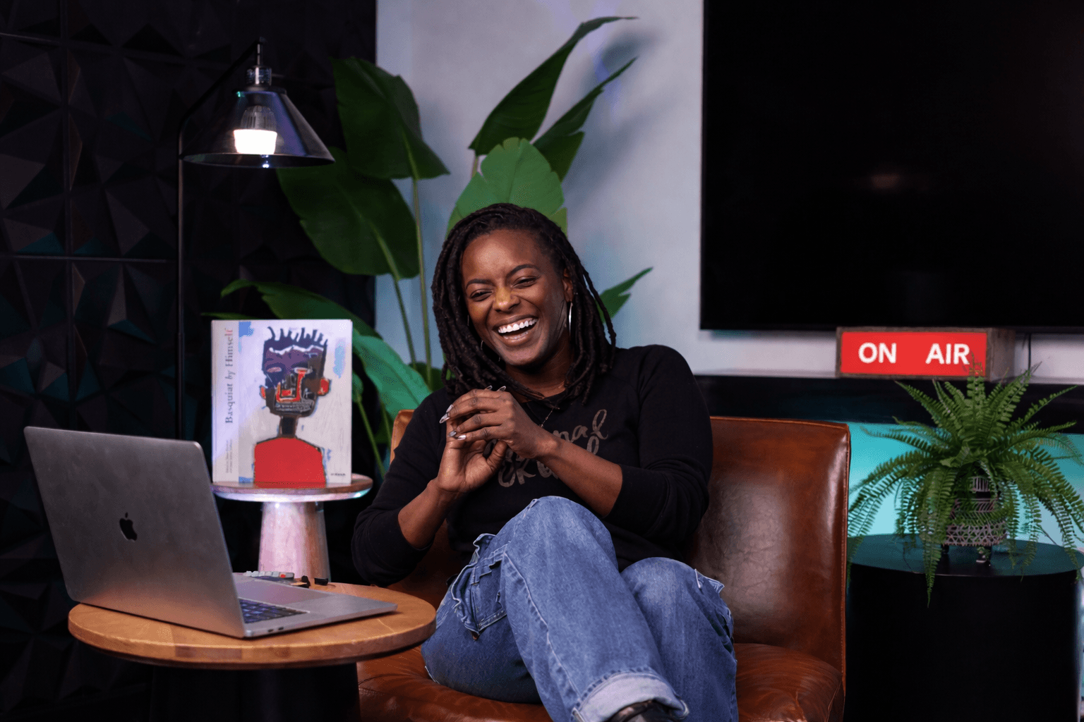
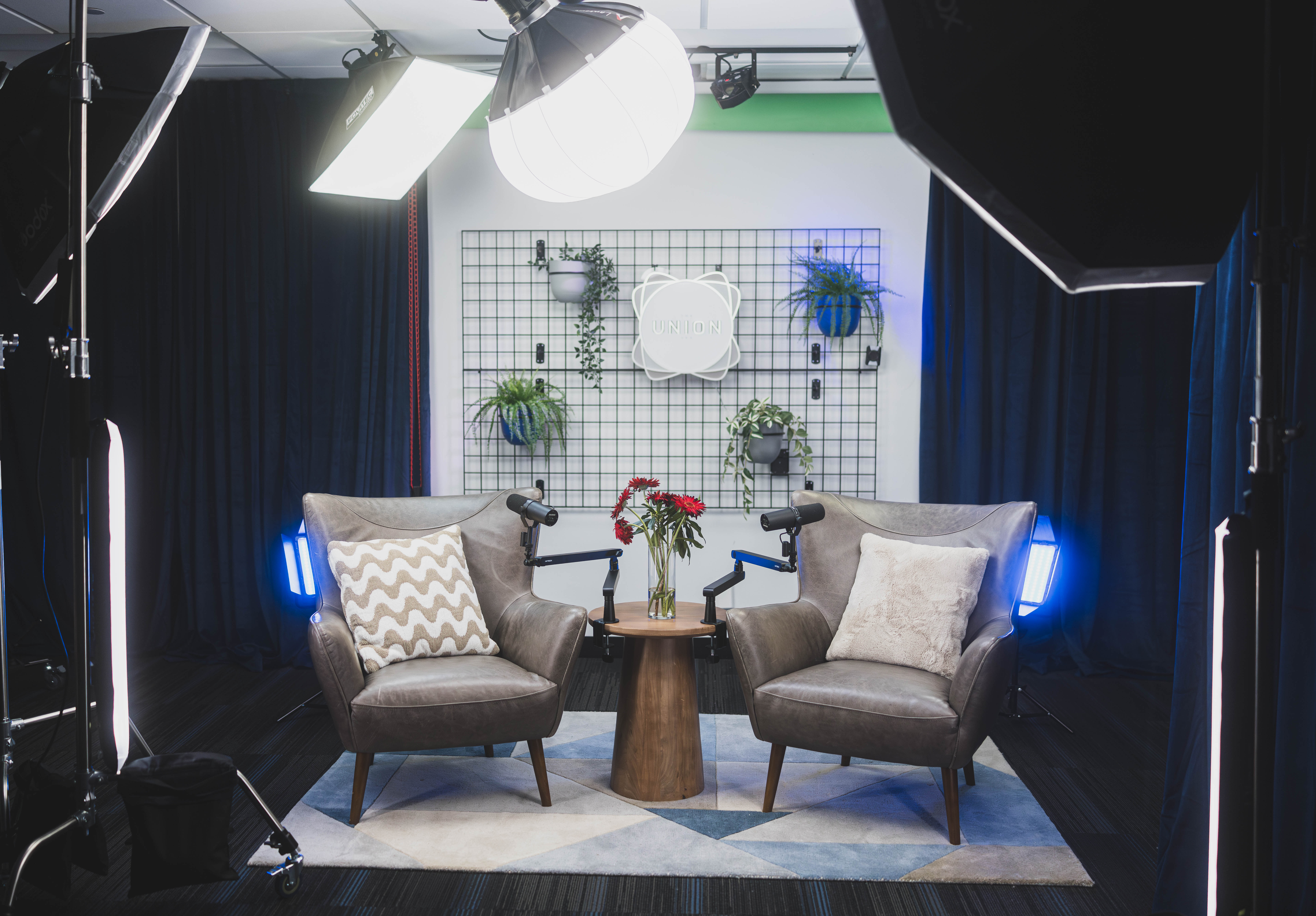
This is where The Union becomes useful in a way that surprises many first-time podcasters. The production studios are built for video and visual content as much as audio. The Blue Pill studio is modular, a controlled environment with sets like The Cove, The Grid, The Stage and Afro Detox. The founder's studio tour describes color backdrops and modular sets that switch from a talking head to a product shoot to a panel without a long reset. That same flexibility works for a cover photo session: you can try a bold solid backdrop for your show cover, then switch to a different set for episode thumbnails, all in one booking.
For bigger visual concepts, the Red Pill studio is designed for larger setups and styled scenes, with sets including Talk Show, The Cypher, QT's Corner and Lip Sync. If you want a cover with a co-host, a styled scene or props, that is a natural fit. You can browse the spaces to see how each set looks before you plan your shoot.
The Union's production team also does custom set design: backdrops, lighting setups, furniture layouts and visual themes built around your brand. If you are not sure what visual world your show should live in, this is exactly the kind of question worth bringing to a producer. A conversation about color, mood and composition can save you a weekend of trial and error.
Turn recordings into thumbnail material
Here is a trick experienced video podcasters use: if you record on camera, your episode footage is a thumbnail goldmine. Every surprised face, every laugh, every "wait, really?" moment is a potential frame.
Tasha films her episodes on a set in Blue Pill. During her episode answering a nine-year-old's question, "Why do cats purr?", she spontaneously cupped her ear and made a confused face when describing a cat's mysterious vibration. That frame became her thumbnail, paired with three words in bold yellow: "Purring is WEIRD."
A few practical tips if you want to work this way:
Plan two or three "thumbnail moments" into your run-of-show. A big reaction to the question, a prop reveal, a moment looking straight into the camera.
Leave room in the frame. If your shot is too tight, you will have no space for text. A slightly wider frame gives your designer options.
Review footage on site. The Union's dedicated fiber internet and Blackmagic Cloud storage are built for reviewing high-resolution footage while you are still on set, so you can confirm you captured usable frames before you leave.
Share files fast. The same cloud sync keeps a remote editor in the loop, so a collaborator can start pulling frames sooner.
The Union's producers also handle this for full-service clients. Post-production deliverables include thumbnails, short captioned clips and pull-quotes, alongside the mixed audio and video cut. If design is not your strength, it is worth asking what that workflow looks like and where your time is best spent. You can read more about the full-service options on the services page.
Build a template so every episode is easy
Tasha's biggest time saver was a template. Once her show cover was done, she built a reusable layout for episode art and thumbnails so that each new episode takes about fifteen minutes instead of two hours.
Her episode square uses the same two brand colors as her cover, a consistent spot for her logo in the corner, and a large speech bubble where the kid's question goes, written in the kid's own words. Her YouTube thumbnails always put her face on the left and the text on the right. Over time, viewers learn to spot her videos in a crowded feed without reading a word.
You can build templates in any design tool you like, from free browser-based tools to professional software. What matters is locking in the decisions: fonts, colors, logo placement, text sizes and photo position.
Working with a designer
If you want a professional to create your cover or template, give them a clear brief. Imagine Tasha hires an illustrative freelance designer named Dev. She would send:
Her show name and one-sentence description.
Her audience (parents of curious kids, ages roughly 6 to 13).
Three adjectives for the feel: warm, smart, playful.
Two or three podcast covers she admires, and what she likes about each.
Her photos from the studio session.
Required deliverables: 3000 x 3000 show cover, editable episode template, 1280 x 720 thumbnail template, and the source files.
Always ask for the editable source files and confirm you own the final artwork. Plenty of creators end up stuck when they want to update a cover and cannot reach the designer who made it.
The Union's community is one of the best places to find this kind of collaborator. It is a space shared by local entrepreneurs, artists, educators and creators, with workshops, community programming and events where you will meet people with complementary skills. Seattle has a deep creative scene, and coworking alongside other creators is often how podcasters find the designer, photographer or editor who becomes part of their team.
Common artwork mistakes to avoid
Testing only at full size. Always preview at phone size before publishing.
Too much text. If it takes more than a glance to read, it is too much.
Clip art and stock clichés. Generic microphones and headphones say "podcast" but tell nobody what your show is about.
Using images you do not have rights to. This can get your art rejected or your episode removed.
Changing your cover constantly. Recognition builds over months. Refresh only with a clear reason.
Ignoring dark mode. Many people browse apps in dark mode. Check that your cover edges do not disappear against a black background.
Clickbait thumbnails. Promise what the episode delivers.
Your pre-publish artwork checklist
Show cover is square, 3000 x 3000 pixels, JPEG or PNG, RGB.
Show name is readable when the image is shrunk to about one inch on your phone.
Design uses one focal point and no more than three colors.
All fonts, photos and graphics are original or properly licensed.
Episode artwork follows your template with the same fonts and colors.
YouTube thumbnail is 1280 x 720, with three to five words and the bottom right corner clear.
Art looks good in both light mode and dark mode.
You have saved editable source files in a shared, backed-up folder.
Social versions are exported in square, 4:5 and 9:16 formats.
Do this this week
Open the podcast app you use most and screenshot the top ten shows in your category. Put the screenshots side by side and shrink them to phone size. Write down which three you can read instantly and why: the colors, the fonts, the focal point. Then sketch three rough cover concepts for your own show on paper (no software yet). Show them to five people from your target audience and ask one question: "What do you think this show is about?" Their answers will tell you more than any design tutorial.
If your sketches point toward a photo-based cover, consider booking a short session in one of the studio sets to capture it properly, and bring your questions about backdrops and lighting to the production team.
Coming up next
Your show now looks as good as it sounds. In Part 17, we tackle transcripts and captioning: how to make your episodes accessible, searchable and easier to clip, and why they quietly help more people find your work.
Start your story at The Union
You do not need to own a camera, a lighting kit or professional design software to create artwork that earns the play. The Union is Seattle creative infrastructure built for exactly this moment: real sets, a production team that understands visual storytelling, and a community of artists and creators who can help you bring your show's look to life.
If you want to talk through your cover concept or plan a photo session, email contact@theunion.io or call 206-551-0964. You can book the studio as a guest by appointment, weekdays from 9 AM to 5 PM. If you are ready to make The Union your creative home, apply for membership. The CoCreate Podcast membership ($300/month, $100 sign-up fee, 2-month commitment) includes the media lab for DIY and full-service productions, and the CoCreate Vodcast membership ($400/month, $100 sign-up fee) suits creators publishing video. CoCreate memberships currently have a waitlist of about a month, so it is worth applying early. Want to start smaller? The CoMmunity membership ($50/month, no sign-up fee, cancel anytime) gives you VIP event access, the digital library and discounted consultations while you get your footing.
The full series
This is Part 16 of 24 in Starting a Podcast at The Union (Post-Production stage). Previous: Part 15, How to Write Show Notes for That Blank Description Box. Next: Part 17, Transcripts and Captions Make Your Podcast Open to Every Listener.